
You've spent hours perfecting your design on screen, adjusting colors until everything looks vibrant and sharp. But when the prints arrive, the colors look dull and the edges are fuzzy. The problem isn't your design — it's the image format. Both PNG and JPEG were built for screens, not ink. Understanding which one to start with (and when to skip both) is the key to getting prints that actually match your expectations.
JPG vs. PNG for printing: Which image format should you choose?
When choosing between JPG vs PNG for print projects, the answer depends on your specific content and workflow. Here's a quick decision matrix to help you decide:
| Format | Best Use | Key Advantage | Print Reality Check |
|---|---|---|---|
| JPEG | High-detail photographs, large posters, product images | Smaller file size with good quality at 90-100% settings | Acceptable for photo printing if resolution is high enough (300 DPI minimum) |
| PNG | Logos, text-heavy graphics, illustrations, stickers | Lossless quality, supports transparency | Printer conversion from RGB to CMYK causes color shifts; transparency can fail |
| Reality | Professional print work | — | Neither is technically "the best" — print shops prefer TIFF or PDF for accurate color and layout preservation |
The best format for printing photos is often neither PNG nor JPEG. While JPEG handles photographs reasonably well, and PNG excels at preserving sharp edges in graphics, professional printers actually prefer formats that support CMYK color profiles and embed proper metadata. Knowing the best use cases for each helps you pick the right image format, but the choice between JPEG or PNG for print is a compromise — you're picking the lesser limitation rather than the perfect solution.
Most print shops can work with either file type or file format, but they'll convert your file behind the scenes. That conversion is where things go wrong. Colors shift, transparency breaks, and quality degrades. Understanding why these failures happen helps you prepare files correctly and set realistic expectations.
Why PNG files cause color shifts when printing
When asking is PNG or JPEG higher quality, the answer seems obvious — PNG uses lossless compression, so it preserves every pixel exactly as you created it. But "lossless" doesn't mean "print-ready." The real problem lies in how screens and printers handle color.
Your monitor displays colors using RGB (red, green, blue), an additive color model where light beams combine to create every shade you see. Printers use CMYK (cyan, magenta, yellow, key/black), a subtractive color model where ink pigments absorb light to produce color. These two systems have different ranges — your screen can display bright, vibrant colors that physical ink simply cannot reproduce.
Why CMYK support is the key difference
The PNG format is a web-first image format designed exclusively for screen display, where its lossless quality and faster load times matter most. The format specification includes no support for CMYK color data. When you send a PNG file to a print shop, the printer's RIP (Raster Image Processor) software automatically converts your RGB colors into CMYK equivalents — but this is a guess, not a precise translation.
The conversion uses generic algorithms that don't account for your specific design choices. Neon greens become muted olive tones. Bright blues turn grayish. Vibrant oranges lose their punch. The printer isn't doing anything wrong — it's working within the physical limitations of ink, and the PNG file format gives it no guidance about your color intentions.
Professional formats like TIFF and PDF allow you to embed CMYK profiles that tell the printer exactly which ink percentages to use. PNG files cannot carry this information. Every PNG file you send for printing undergoes an automatic, uncontrolled RGB-to-CMYK conversion that shifts your colors away from what you approved on screen.
When to use PNG for transparent backgrounds — and when it fails
PNG's transparency feature is its signature advantage over JPEG — you can create logos with clear backgrounds, layer graphics without white boxes, and design stickers that blend into any surface. This alpha channel support makes PNG the default choice for graphic designers working on web and screen projects.
The same caution applies to a GIF (Graphics Interchange Format) file, which also supports transparency for screens but is poorly suited to print. But printers interpret transparency inconsistently. Some print services fill transparent areas with white ink. Others substitute black. Some leave the background empty (which only works if you're printing on white paper). The result depends on the printer's RIP software settings, the type of printing press, and whether anyone manually checks your file before sending it to production.
If you submit a logo with a transparent background expecting it to print on colored paper, you might receive business cards with black rectangles behind your design. Always verify your printer's transparency handling policy, and consider flattening your PNG image to a white background before submission to avoid surprises.
JPEG file compression: Why JPG image artifacts ruin prints
JPEG uses lossy compression to achieve smaller file sizes — the image format discards image data during the save process. For JPG vs PNG comparisons, this image compression sounds like an obvious weakness of the JPG format. But the quality loss only becomes visible when you compress aggressively or edit repeatedly. High-quality JPEG files (saved at 90-100% quality settings) look nearly identical to lossless formats when viewed on screen.
Print magnifies every flaw. Small or heavily compressed JPEG images that look acceptable on your laptop display become "crunchy" or "blocky" when printed at full size. Smooth gradients develop visible bands of color. Sharp edges blur into halos. The compression artifacts that your eye forgives on a screen become glaringly obvious on paper.
Lossy compression explained
Think of JPEG compression like packing a suitcase for a long trip. You can fit everything by compressing clothes, rolling them tight, and discarding items you won't need. JPEG does the same with image data — it identifies "invisible" details (subtle color variations, minor texture differences) and throws them away to reduce file size.
Each time you save a JPEG file, the compression process repeats. If you open a JPEG, make edits, and save it again, the file format discards more data. This generational loss compounds over multiple edits, even though the smaller files give faster load times online. After five or six save cycles, even high-quality JPEG files show visible degradation — the digital equivalent of making photocopies of photocopies.
JPEG handles photographs well because natural images contain smooth gradients and organic textures where small data losses blend in. The format struggles with sharp edges, solid blocks of color, and images with text — exactly the elements common in logos and graphic design. You'll see blocky squares (called "artifacts") around high-contrast boundaries, color banding in gradients, and blurred edges where crisp lines should exist.
The 300 DPI rule: Image quality vs. file size
Regardless of whether you choose PNG or JPEG, your digital image needs sufficient resolution to print clearly — this affects image quality across all image file types. The standard is 300 DPI (dots per inch) — printers need 300 pixels for every inch of paper to reproduce photographic detail without visible pixelation.
Here's the math that matters: divide your image's pixel dimensions by 300 to calculate its maximum sharp print size. A 3000×2000 pixel photograph can print at 10×6.67 inches (3000÷300 = 10, 2000÷300 = 6.67). Print it larger than that, and the printer must stretch pixels, creating visible blur.
You cannot increase resolution after the fact. Resizing a 1000×1000 pixel image file to 3000×3000 in an editing program does not add detail — it just makes fuzzy pixels bigger. The software invents data through interpolation (guessing what should be between existing pixels), but the result always looks softer than an image captured or created at the target size from the start.
Large-format posters viewed from a distance can use lower image resolution (150-200 DPI) because viewers stand farther away, but any print examined up close (business cards, brochures, photo prints) requires the full 300 DPI. This rule applies equally to JPG and PNG files — format choice affects compression quality and color accuracy, not the fundamental resolution requirement.
Beyond JPG and PNG files: Why pros use TIFF, PDF, and GIF
When professionals discuss the best format for printing photos or graphics, the conversation rarely focuses on PNG versus JPEG. Both formats serve as acceptable compromises for everyday print projects, but high-end commercial printing relies on formats specifically designed for print workflows.
TIFF: The gold standard for detail
TIFF (Tagged Image File Format) uses lossless compression, preserving every pixel of your original image without any quality degradation. Unlike PNG, TIFF supports both RGB and CMYK color modes, allowing photographers and designers to convert their images to the printer's native color space before submission.
Fine art photographers rely on TIFF for gallery prints because the format can embed ICC (International Color Consortium) profiles — precise instructions that tell the printer exactly how to reproduce each color. When you convert an image to CMYK using a professional editing tool, then save it as a TIFF with the target printer's color profile embedded, you maintain complete control over the color reproduction process.
The trade-off is file size. Uncompressed TIFF files for high-resolution photographs often reach 50-200 MB. This makes them impractical for email or online transfer, but professional print shops expect large files and have systems to handle them (FTP upload, cloud storage space links, or physical media delivery).
Print labs and commercial printers list TIFF as their preferred format for photographic work precisely because it eliminates the guesswork. The file contains all the color data, at full resolution, with explicit instructions for the RIP software. No automatic conversions. No surprises.
PDF: The king of layouts
PDF (Portable Document Format) solves a different problem — combining images with text and vector graphics into a single print-ready document that looks identical on any device. When you're preparing brochures, business cards, flyers, or magazines, PDF preserves fonts, layout spacing, and embedded images without requiring the print shop to have your design software or fonts installed.Need to edit the text inside a print file? You can convert a PDF to Word to make revisions before sending it off.And if the finished PDF is too large to email to your print shop, you can compress a PDF to shrink it while keeping the layout intact.
Commercial printers can process PDF files directly without conversion. The format supports CMYK color, spot color channels (for specialty inks), embedded color profiles, and transparency — everything needed for professional printing. PDF has become the universal standard for print submission because it guarantees "what you see is what you get" (WYSIWYG). Your carefully designed layout won't shift when the print shop opens your file. Text won't reflow or change fonts. Colors won't spontaneously shift because the file explicitly states whether it contains RGB or CMYK data. The printer receives a complete, self-contained package with all the information needed for accurate reproduction.If you only need a quick on-screen preview or a web-friendly thumbnail of the layout, you can convert a PDF to JPG — just keep the original PDF for the actual print job.
How to prepare JPG and PNG files for the printer
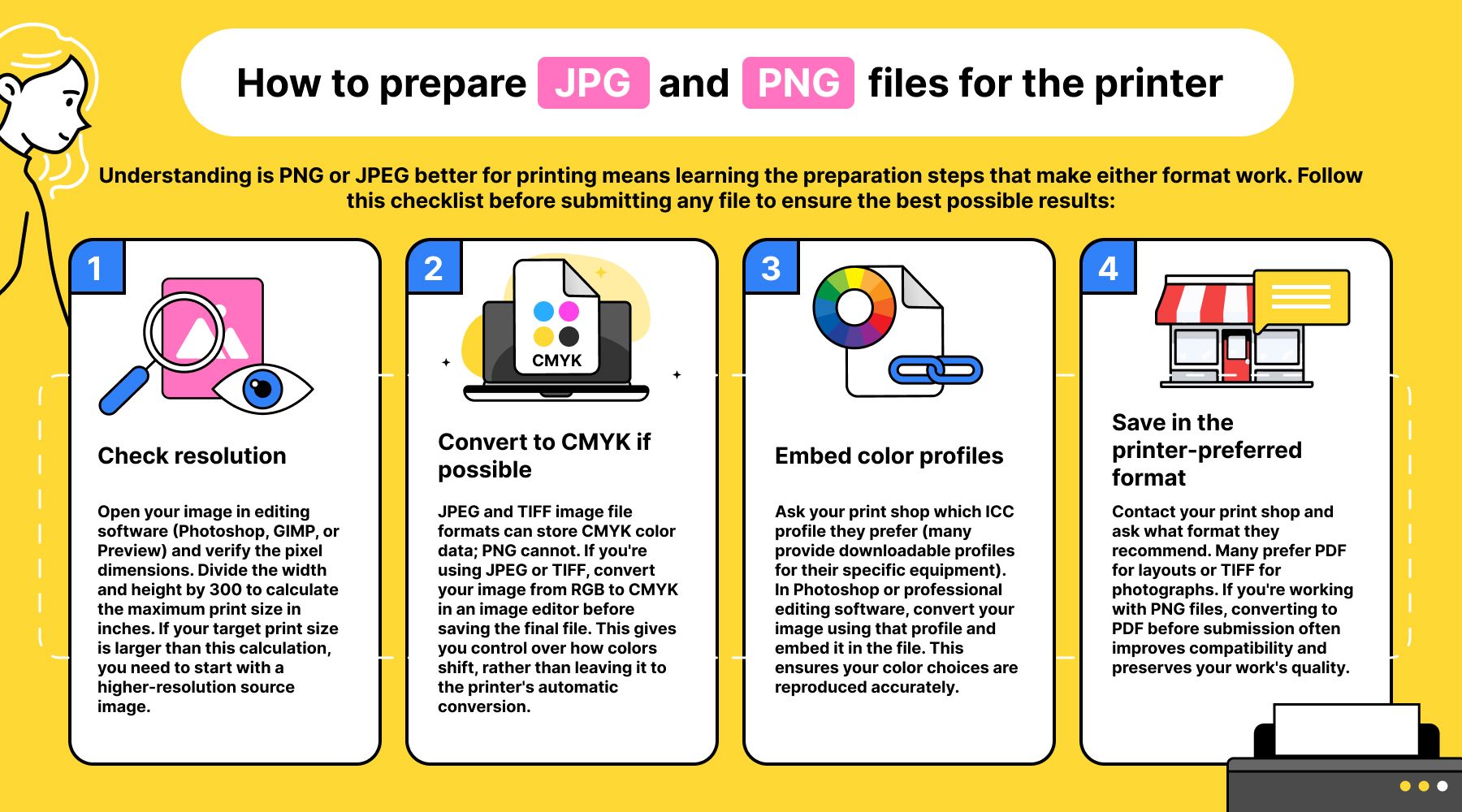
Understanding is PNG or JPEG better for printing means learning the preparation steps that make either format work. Follow this checklist before submitting any file to ensure the best possible results:
- Check resolution. Open your image in editing software (Photoshop, GIMP, or Preview) and verify the pixel dimensions. Divide the width and height by 300 to calculate the maximum print size in inches. If your target print size is larger than this calculation, you need to start with a higher-resolution source image.
- Convert to CMYK if possible. JPEG and TIFF image file formats can store CMYK color data; PNG cannot. If you're using JPEG or TIFF, convert your image from RGB to CMYK in an image editor before saving the final file. This gives you control over how colors shift, rather than leaving it to the printer's automatic conversion.
- Embed color profiles. Ask your print shop which ICC profile they prefer (many provide downloadable profiles for their specific equipment). In Photoshop or professional editing software, convert your image using that profile and embed it in the file. This ensures your color choices are reproduced accurately.
- Save in the printer-preferred format. Contact your print shop and ask what format they recommend. Many prefer PDF for layouts or TIFF for photographs. If you're working with PNG files, converting to PDF before submission often improves compatibility and preserves your work's quality.
Out of gamut: The hidden difference between JPG and PNG on screen vs. print
Here's the technical insight most articles miss: your monitor can display colors that no printer on Earth can reproduce. RGB screens generate light directly, creating bright, saturated colors (neon greens, electric blues, vibrant magentas) that exist outside the physical range of CMYK inks. These "out of gamut" colors will automatically shift to the closest printable approximation, and that shift is often dramatic.
Professional designers use a "Gamut Warning" tool to preview these shifts before sending files to the printer. In Adobe Photoshop, go to View > Gamut Warning. The software highlights every pixel in your image that falls outside the CMYK color range, marking it with a bright overlay (usually neon gray or magenta). These highlighted areas will change color when printed — guaranteed.
GIMP (the free, open-source alternative) offers similar functionality through View > Display Filters > Color Deficient Vision, though the gamut preview requires manual color profile selection. Either tool allows you to identify problem colors while you still have time to adjust them, choosing printable alternatives that stay close to your original vision.
This proactive approach solves the "why does my print look dull?" complaint before you spend money on production. You see exactly which colors will shift, make deliberate adjustments to compensate, and submit a file that accounts for the physical limitations of ink on paper. No other format comparison article covers this workflow step — it's the difference between hoping your colors will print correctly and knowing they will.
Whatever format your printer prefers, you can handle every conversion in one place with OnlyDoc’s free PDF converter.


